Showing posts with label logo. Show all posts

Tuesday, July 22, 2014

Luke's Local Delivery Logo


Early last year, Luke Chappell of Luke's Local Delivery came to me to design a new logo for his delivery business. He was not sure what he wanted but it needed to be genuine and timeless.

After much brainstorming, I came up with the idea of using a fox for the mark. In my research I found, that in alchemy, the fox was considered the cultivator of the Elixir of Life. In Northern Native American tribes the fox is considered a noble messenger. This was perfect symbolism for Luke's company because it felt in line with his philosophy. He considers it very important to run a company that is values-driven, that is environmentally sustainable and is good for the local economy. (His parents are well known for such ethical business practices, Tom and Kate, who founded Tom's of Maine, in 1970.)

As for the style of the mark, Luke decided on a woodblock feel. Because I do not consider myself an illustrator, this was outside of my comfort zone. Of course, being in that zone always ends up being the best experience for a designer, and Luke was very happy with his new logo!

Saturday, March 1, 2014

Milton And Small Coffee Design Hang Tags


Milton and Small Hang Tag, Front


Milton and Small Hang Tag, Back Detail


I was just going through some past projects and I came across the collateral that I designed for Milton and Small Beverage Co. I started with the logo I designed for them while working on their coffee label. (The label won a sa-weet Award of Excellence in the prestigious Communication Arts Design Competition! ) Rather than keeping with the ornamental feeling that I had created for the coffee bottle, I went clean and simple.  Their business cards and hang tags (pictured), however, stayed within the aesthetic of an apothecary, which was the muse of the label.  This gave them the leeway for future design directions for new products and labels but still had a sense of continuity with their original product. 

Wednesday, January 15, 2014

Lucy Cuneo Photography Logo


I worked on a logo for photographer, Lucy Cuneo. She is one of the most lovely, gracious, perceptive people I have met. I wanted her logo to match both her style of photography and the grace and loveliness of the woman herself.

This is the first instance of trying my hand at calligraphy and both Lucy and I love the imperfection of the C. For the logo color, we decided to go with a family of colors. I imagined Lucy deciding what color she wanted to use, the same way she would decide what outfit she felt like wearing, it would all depend on her mood. Why limit yourself??

Tuesday, December 17, 2013

Yummy Supper Logo Refresh


How lucky was I to work with one of the most talented photographers I know? Erin Scott of Yummy Supper asked me to refresh her logo. Sigh, she is the best. I can't wait for her book to be released!

Thursday, October 31, 2013

Happy Halloween!

Happy Halloween! I had to make adjustments to Isley's Working Man costume. Instead of a big logo screen-printed on a shirt, I have designed a sticker to go on the front of his hard hat. Color yet to be determined! I love them all but we'll see how they looked printed out and attached to his hat.

Thursday, October 24, 2013

Isley's Halloween Logo


I have been working on my son's Halloween costume today. He is a two-and-a-half year old that is obsessed, as many little guys are, with construction sites. Well actually, construction sites, backhoes, front loaders, bulldozers, excavators, you name it, he knows it. And l.o.v.e.s it. (What is up with how that so many little boys are into big machines. It's kind of cray-cray.)

It makes sense, then, that his heroes are the people that make it all happen. He calls them the"Workin' Man." And since we all like to dress up as our heroes, that's exactly what he's going to do. Ask him what he is going to be for Halloween and that is what he'll tell you with great gusto. A Workin' Man!

I felt like I had to come up with a strategy, however,  for when he goes Trick-Or-Treating. I want folks answering their doors to look at Isley and tell him "aha, and you're a working man, I see." Not something close, like a construction worker, or a carpenter. And since I am a nerdy graphic designer, what better way to sell something than with a logo?? A "Workin' Man" logo that he could wear proudly on his chest. 

I found beautiful and classic Union labels and logos to pull from for the design. I will screen-print it, with help from me good friend, Cynthia Warren. I still have a bit more finessing but I think I am close.

The coolio facet to this costume is that when Isley was born the baby announcement I designed had a union-made logo as well. Guess I am starting a trend with this little guy...

Friday, October 11, 2013

Monday, September 23, 2013

Various logos


The Poppery, a popcorn shop.


Agent Records logo
(An exercise in logo making.)


Emilie's Pantry logo
Visual inspiration came from the marks on the bottom of chinaware.


Chez Panisse Floor Staff logo
(An exercise in logo making.)


Tuesday, September 17, 2013

Oaktown Spice Shop Identity


Tracy Lenihan Design Studio


I have been in the process of designing the website for my folks at Oaktown Spice Shop. Two years ago they came to me when they were planning on opening their store. I created their identity which included their logo, their business cards, receipts, letterhead, color palettes, the signage in the store as well as outside, their labels, and their temporary splash page.

We are now working on their e-commerce website. My photography will be used for the site, thanks to a wonderful team of stylists, and two amazing photographers. (Thank you Erin Scott. You are a photography genius.)


Monday, September 9, 2013

Eating For Education. 40th Anniversary of Chez Panisse Restaurant


Tracy Lenihan Design


Chez Panisse's 43rd birthday just passed quietly this year on August 28th. The big celebrations took place on the restaurant's 40th. I was brought in by the extraordinary Samin Nosrat for a special event "Eating for Education." It was an effort to bring a national awareness to Edible Education, and Alice thought to use the restaurant's big birthday as an inspiration for the event. I designed a logo, postcard, and flyer for restaurants across the country to educate and raise money for their own local edible schoolyards.

The 40th birthday celebration was quite massive, with many different events at many venues, and over a stretch of time. There were dinners all over the Bay Area, the restaurant itself had a open sidewalk cafe and the Berkeley Art Museum held a huge event for the public.

I had great fun designing the signage for the sidewalk cafe at Chez Panisse. Alice wanted the typography to look and feel like the Bar de la Marine from the original Marcel Pagnol trilogies. I also was asked to do a cheeky temporary tattoo design for the Berkeley Museum event. It read: I am edible. I added to the design Eat me, in Latin. I used the tattoo to introduce the newly re-designed identity of the Edible Schoolyard Project, done by Green Dragon Office, as well as an image of the radish that Alice uses as her personal symbol.  The tattoos were handed out to hundreds of people at the event.


Saturday, September 7, 2013

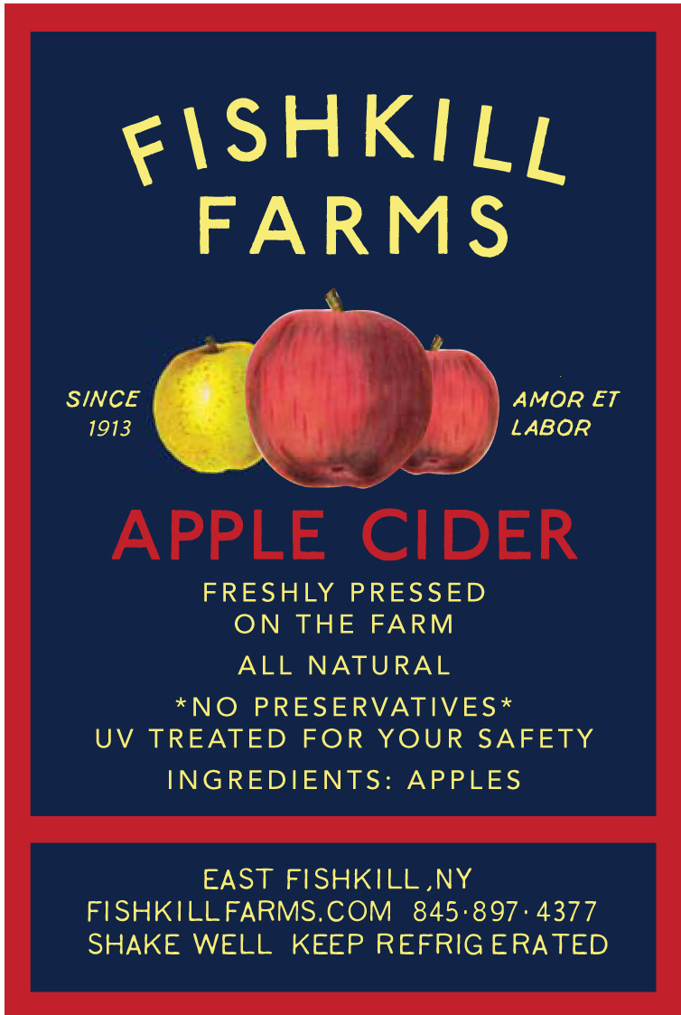
Fishkill Farms Identity Re-design


I have been working with Josh Morgenthau, a third generation farmer, on re-designing his whole identity for Fishkill Farms. As things often go in this hectic world, we have been working on various projects for him, not necessarily in the logical order of a new look but who cares!

We have recently finished the label for his apple cider, an invitation/flyer and poster for his farm's centennial celebration, and for t-shirts. We'll have more projects on their way.

Bartavelle Logo


Loved working with my friend Suzanne Drexhage on the logo for her coffee and wine bar, Bartavelle,  last year. We are starting to discuss a website for her business, so the logo is on my mind. I had a great time playing with the typography. I used the familiar Extended Trade Gothic, but I hand-set that sucker with the version from my trusty encyclopedia of old typefaces. Why? It feels and looks like a human touched it, doesn't it?

This is one of the few times that I have felt like a project was destined for me. Bartavelle opened in the spot of the long-lived Cafe Fanny, where I worked at as a pipsqueak many years ago. It was where my history with the space, the people, and the world of Chez Panisse and Alice Waters began.

If you haven't tried Suzanne's porridge yet, run don't walk to Bartavelle in Berkeley. It will invade your dreams it's so dang good.

Tuesday, April 16, 2013


My Milton & Small bottle design just recently had a great write up on Honestly YUM and the photos have spread like wild-fire on the blogosphere! We started with the premise of an apothecary bottle for the both packaging and logo. Pretty dang happy how it turned out, and by the looks of the "likes" on Tumblr so are a lot of other folks. 


These guys are great AND their coffee is delicious!